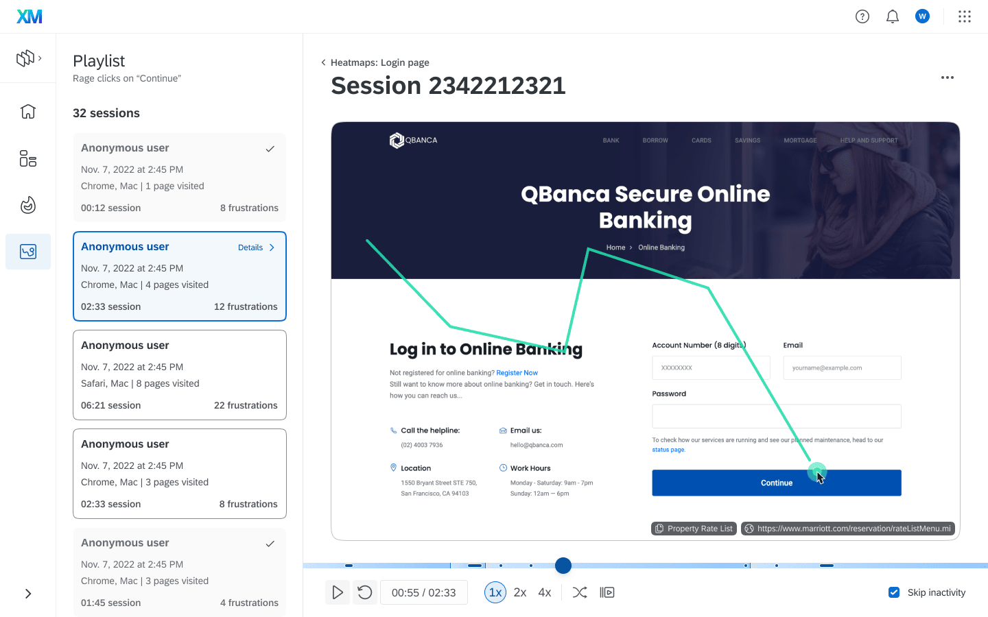
Qualtrics Digital Experience Analytics
DXA is a collection of analysis tools that work together in a single app to elevate Digital at Qualtrics from a simple feedback-focused solution into a market-competitive analytics tool.
I worked with Product and Engineering Leadership to articulate a vision, refine and validate with users, build organizational alignment, and scale the team.
Contributions
Prototyping, Leadership presentation, Design Strategy
Format
Architecture, Vision

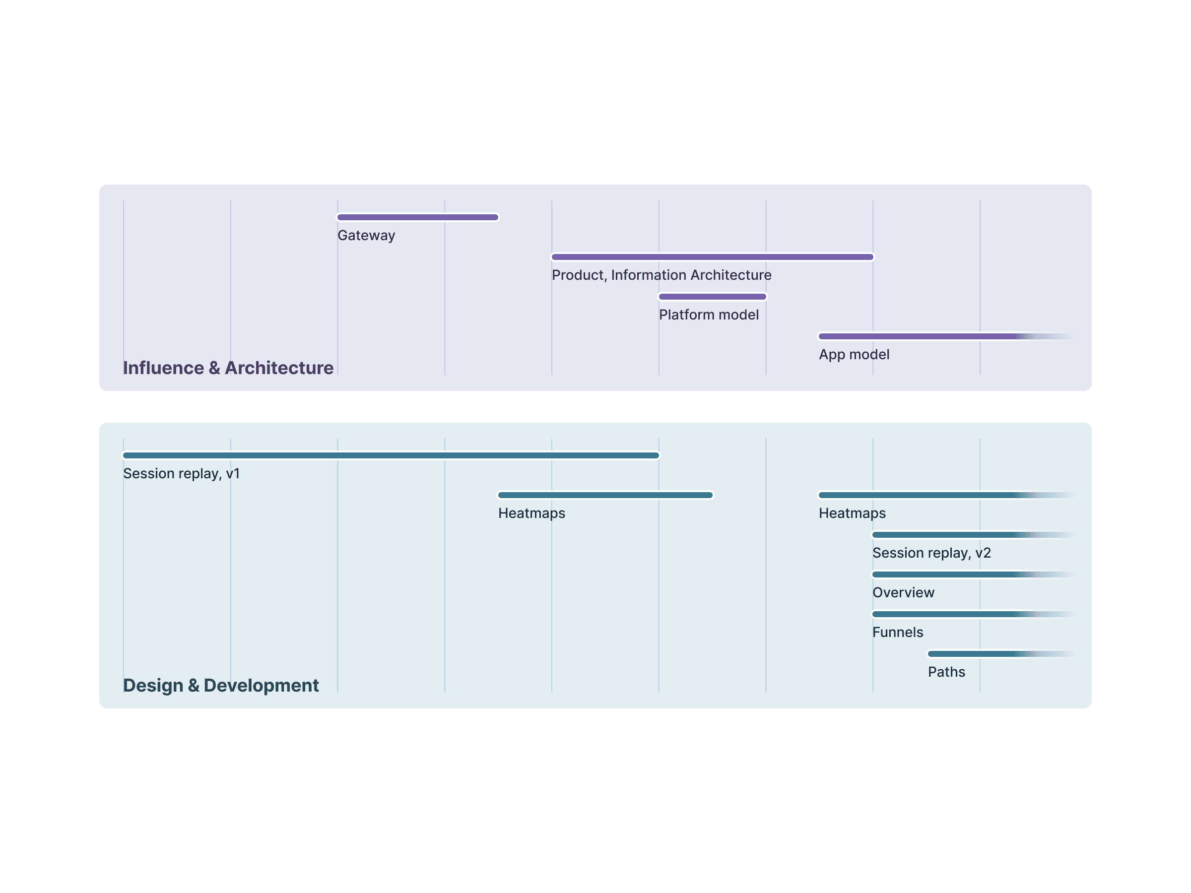
Vision work + product development
As development of Session Replay progressed, I started working with stakeholders on what would come next.
Initially, we set out to define a more digital-first version of Qualtrics. Through iteration and feedback, the scope and strategy evolved to Digital tools in Qualtrics, and then to a stand-alone Digital Platform.
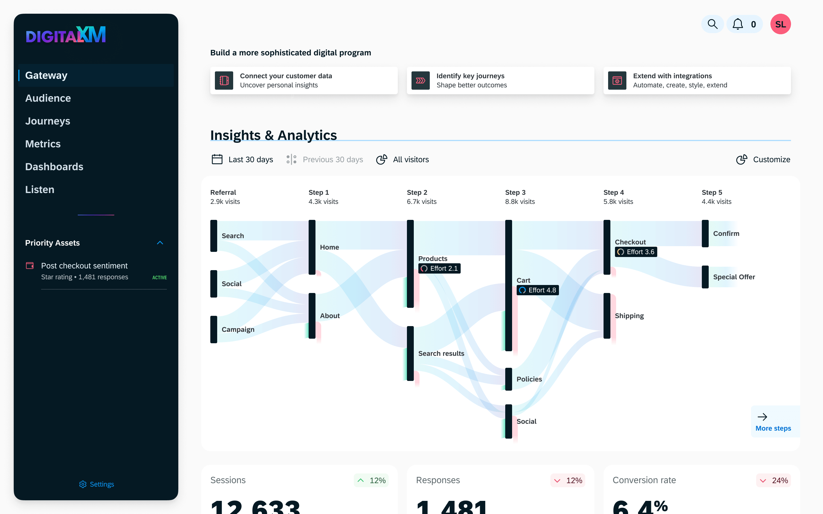
Digital Gateway
Qualtrics is powerful but complicated. Research, usage data, and user feedback all show that new customers have a hard time getting started and the path to more mature usage is steep.
I started by mapping out what features were table stakes and looked for ways to streamline them. The driving principle was to get users to insights quicker.
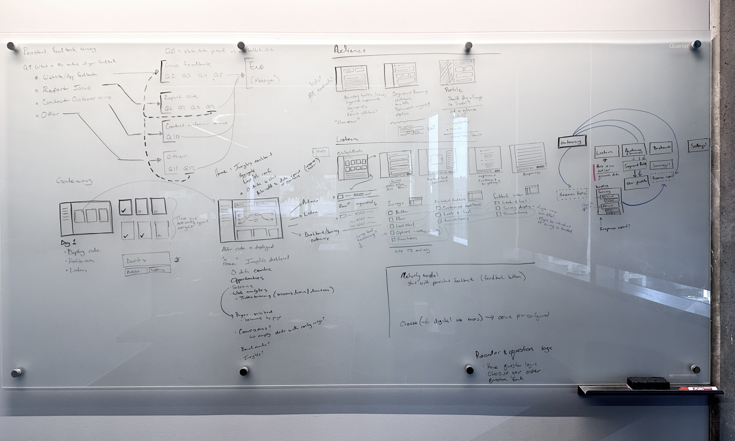
Centering Digital at Qualtrics, and simplifying.
Qualtrics capabilities are typically siloed and have a lot of depth: Segments are a part of profiles and distributions. Surveys are incredibly robust, but Digital feedback tends to be more succinct. Reporting involves schematizing and joining datasets and then building metrics, widgets, and reports.
Bringing select capabilities closer together in a simplified format demonstrated not just how Digital could increase time to value.
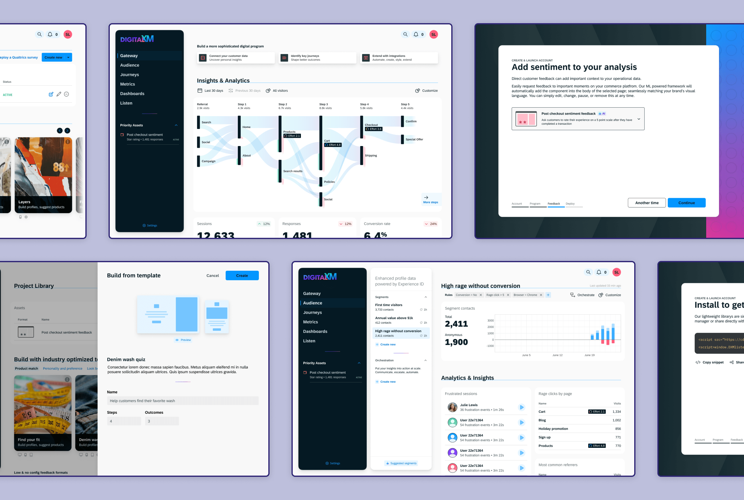
I walked partner teams through an initial concept to build alignment and understand roadmaps. There was interest, but practical concerns with scope and unique customization
Qualtrics Program Architecture
As Session Replay neared launch we started collecting feedback from early access users. I also worked with UXR to validate those asks through concept testing aimed at prioritizing new features. Customers wanted more Digital tools that worked seamlessly together.
I worked with Product to re-calibrate our approach to change from a digital-first version of Qualtrics to a digital toolset built within a Qualtrics Program.
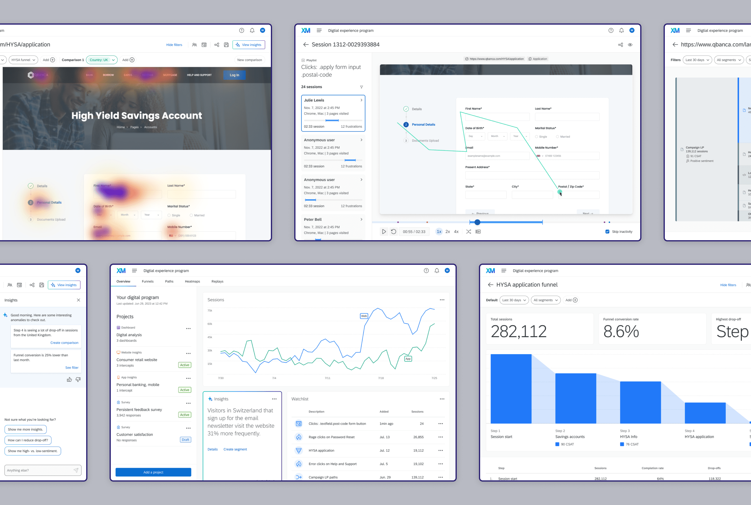
I presented this demo to leadership. It emphasized how tools work together to move the user from a wide to a specific understanding of their data and how AI can uncover details worth investigating
Platform architecture
With leadership on board, I worked with engineering to do a deeper technical evaluation. Qualtrics Programs solved some of the technical and user needs but skewed towards solving admin workflows interspersed with analysis.
To drive clarity for users and solve long-running ease-of-use criticism, we chose to build the analysis tools in a new and separate Digital Platform.
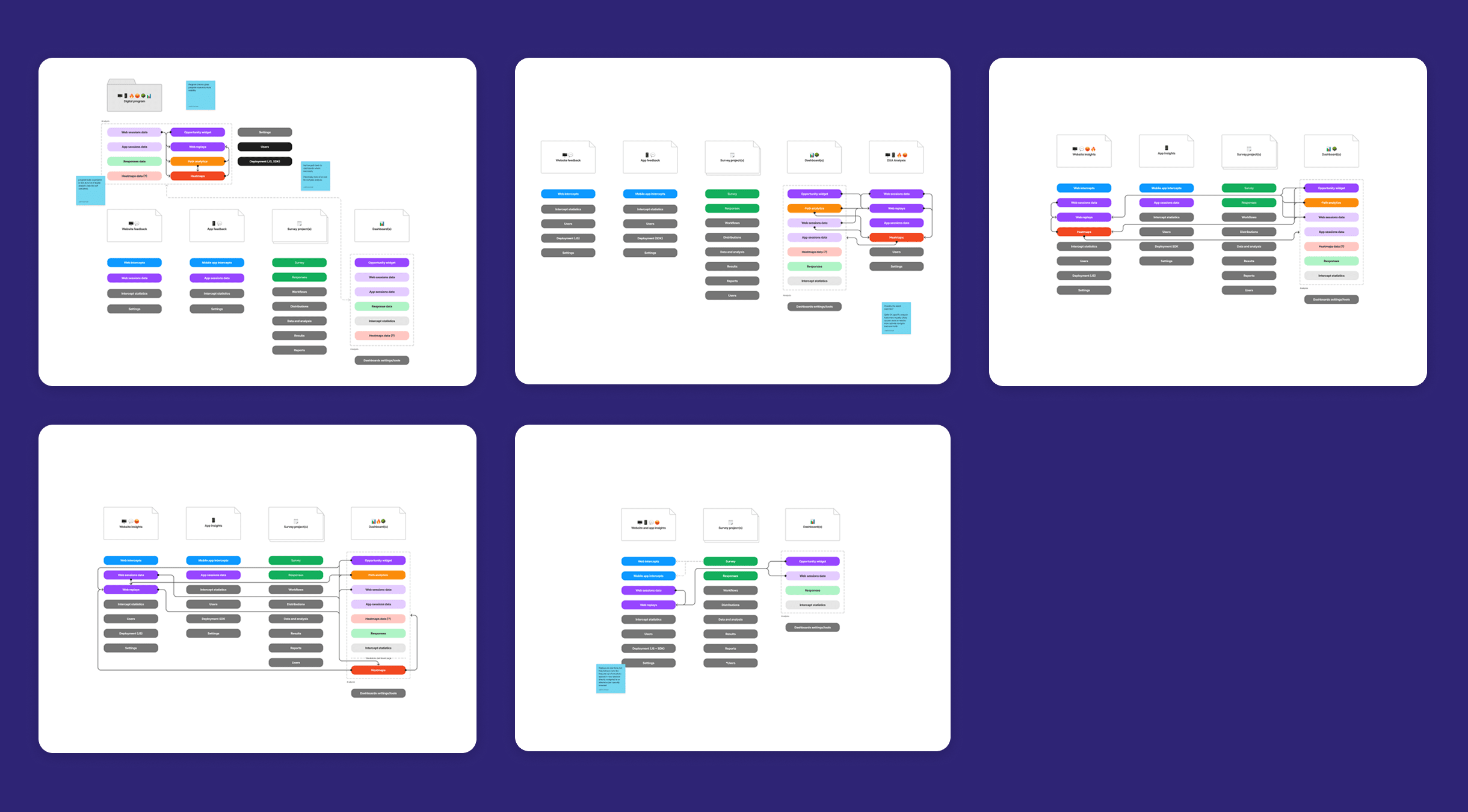
Platform design anchored by its key features
The Digital platform required the design new a new nav, wayfinding affordances, and bespoke shared filtering. Those decisions were anchored by the needs of the corresponding features being developed in parallel. I led a team of designers to design platform solutions while also owning two primary features.
Heatmaps case study

Replays case study
