Qualtrics DXA Heatmaps
An analytics tool that visualizes aggregate interactions and frustrations during digital experiences. Created as part of a new digital experience analytics platform indexed on tools that work together while emphasizing time-to-value
I owned the 0-1 design for this tool while also leading a team of designers to build the other platform features and systems.
Contributions
UX & UI Design, Information Architecture, Research, Team Building, Prototyping, Design System, Accessibility
Format
Responsive web, Product Feature
Designing a tool and a platform
This new capability stemmed from the successful launch of session replay, and work I did in collaboration with Product and Engineering leadership to define a long-term vision and architecture.
I designed this tool in addition to leading a team of 4 additional designers to create and build a suite of tools that work together and establish a new Digital platform.
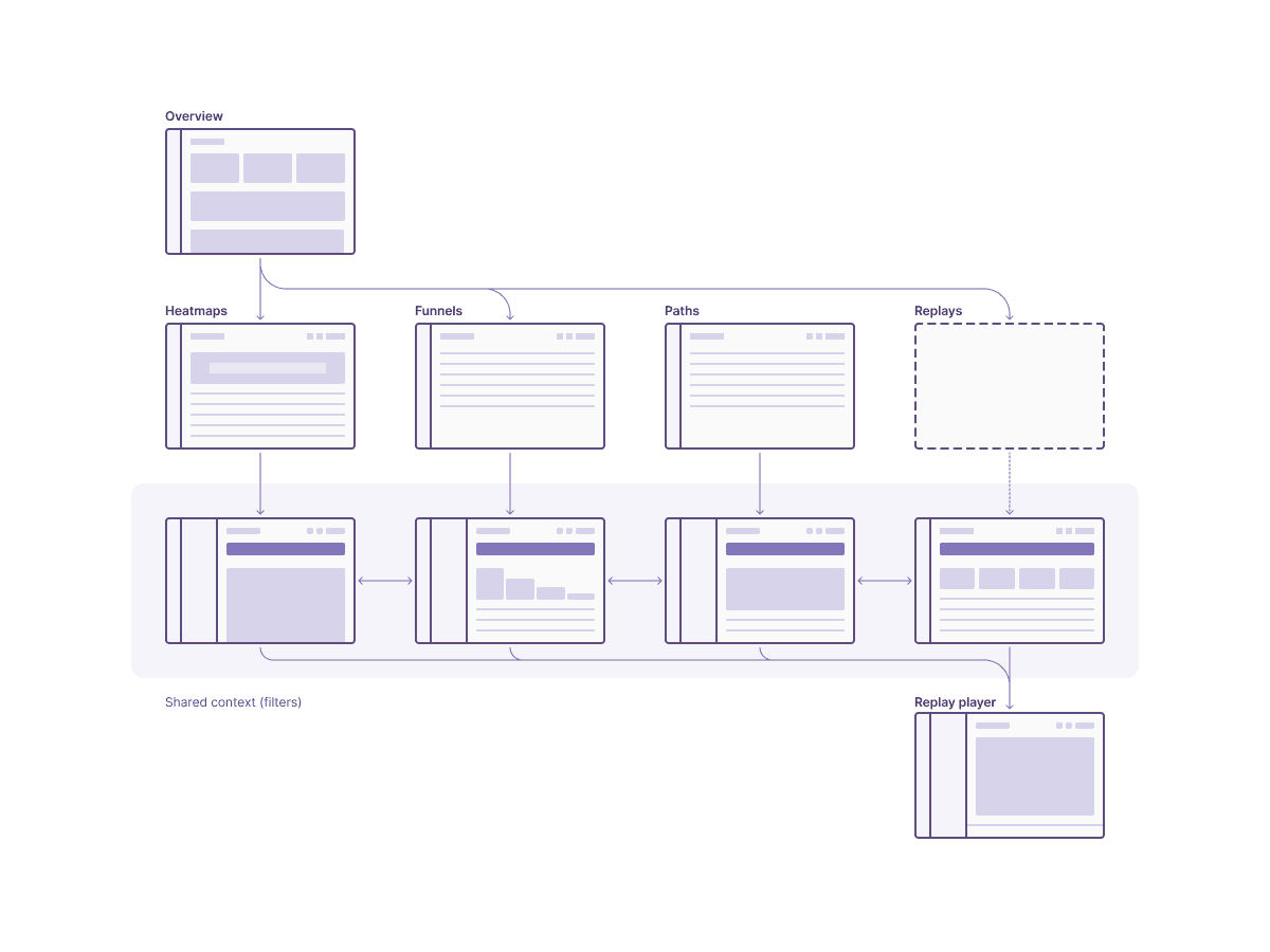
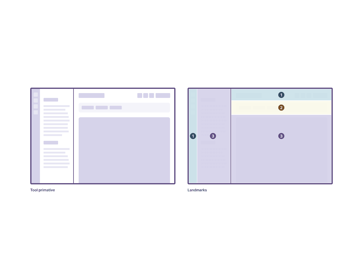
Designing for transitive, created, and saved states
Heatmaps are sometimes static reports that a user manually configures. I also needed to account for them being generated contextually (and usually only temporarily) by other app tools and reporting surfaces in Qualtrics.
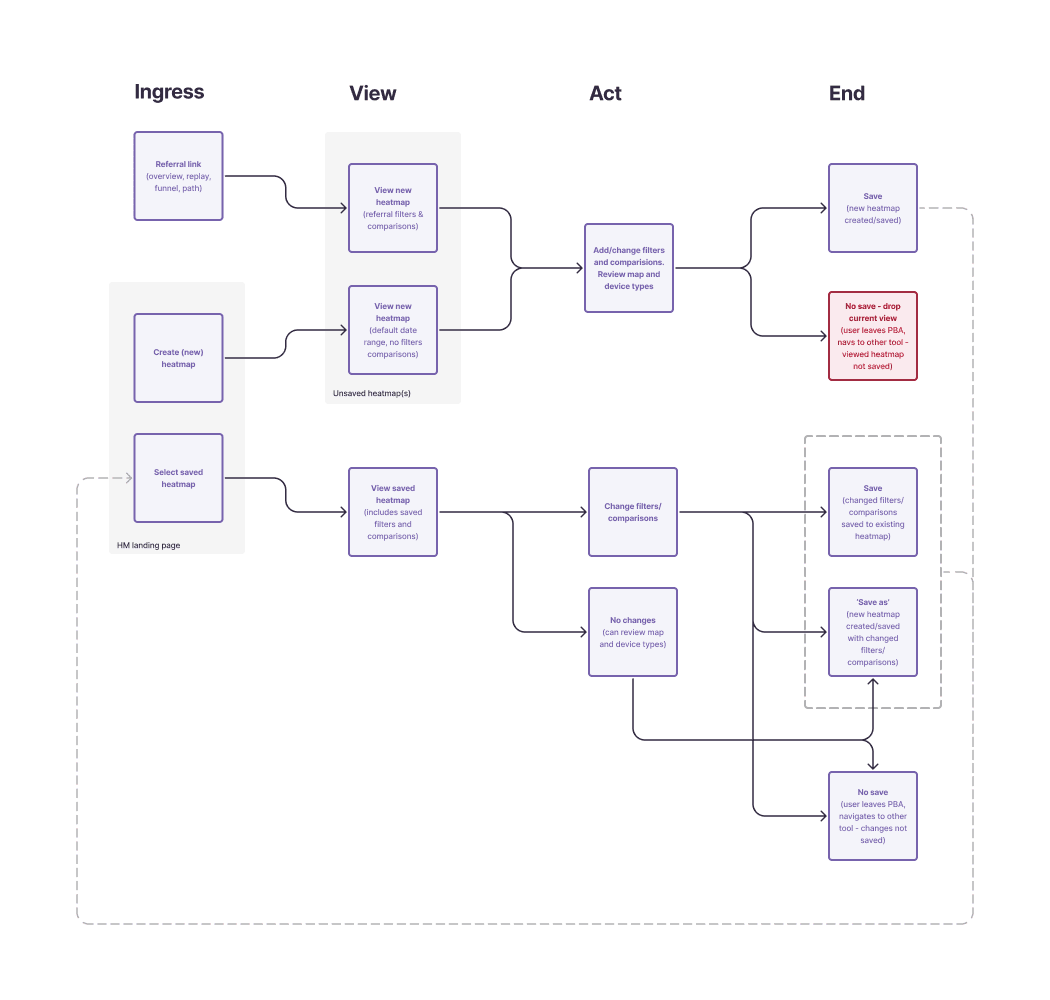
I worked with UXR to run usability tests on creation and traversal flows. In mid-fidelity, users were universally successful and mostly positive in their feedback
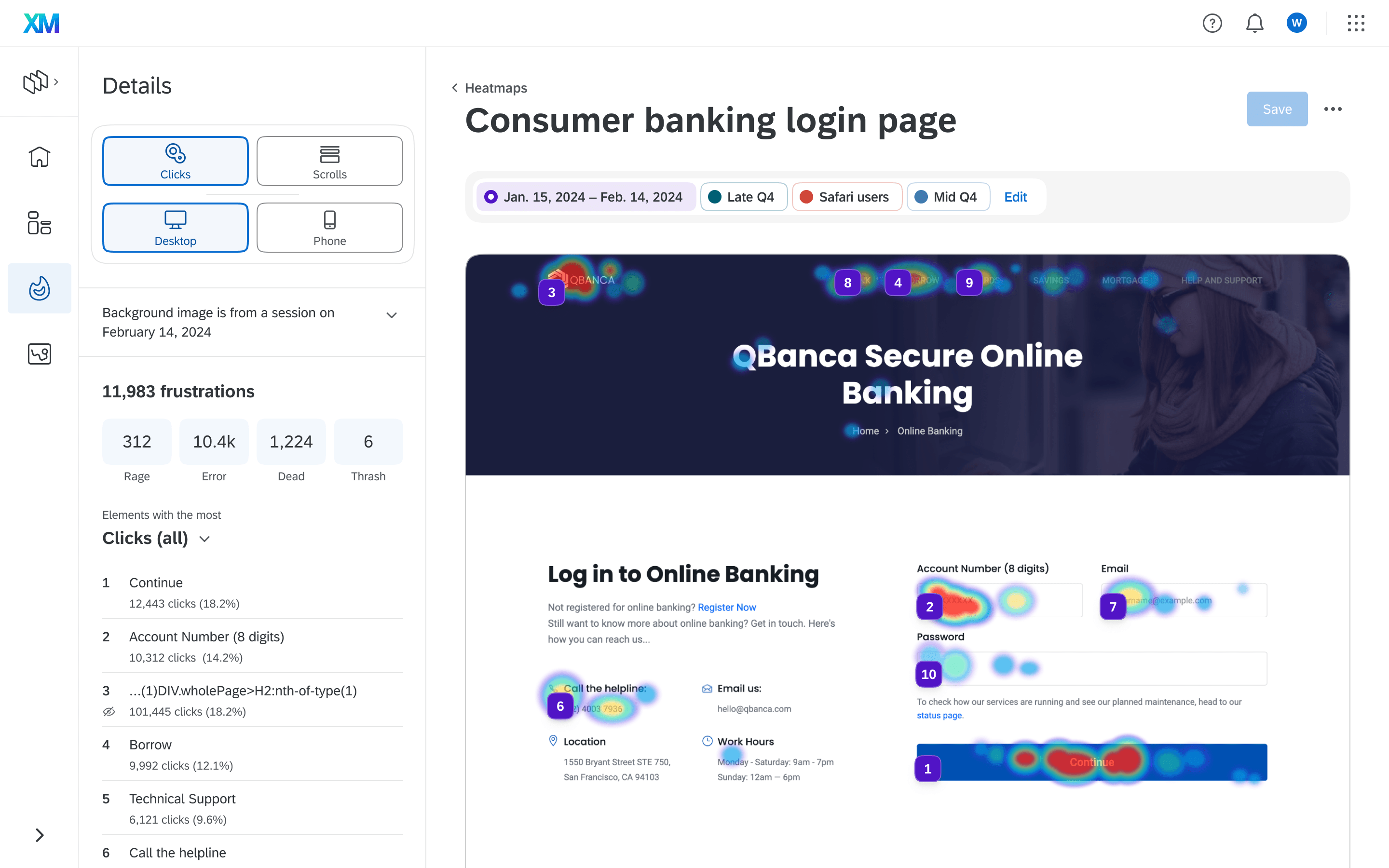
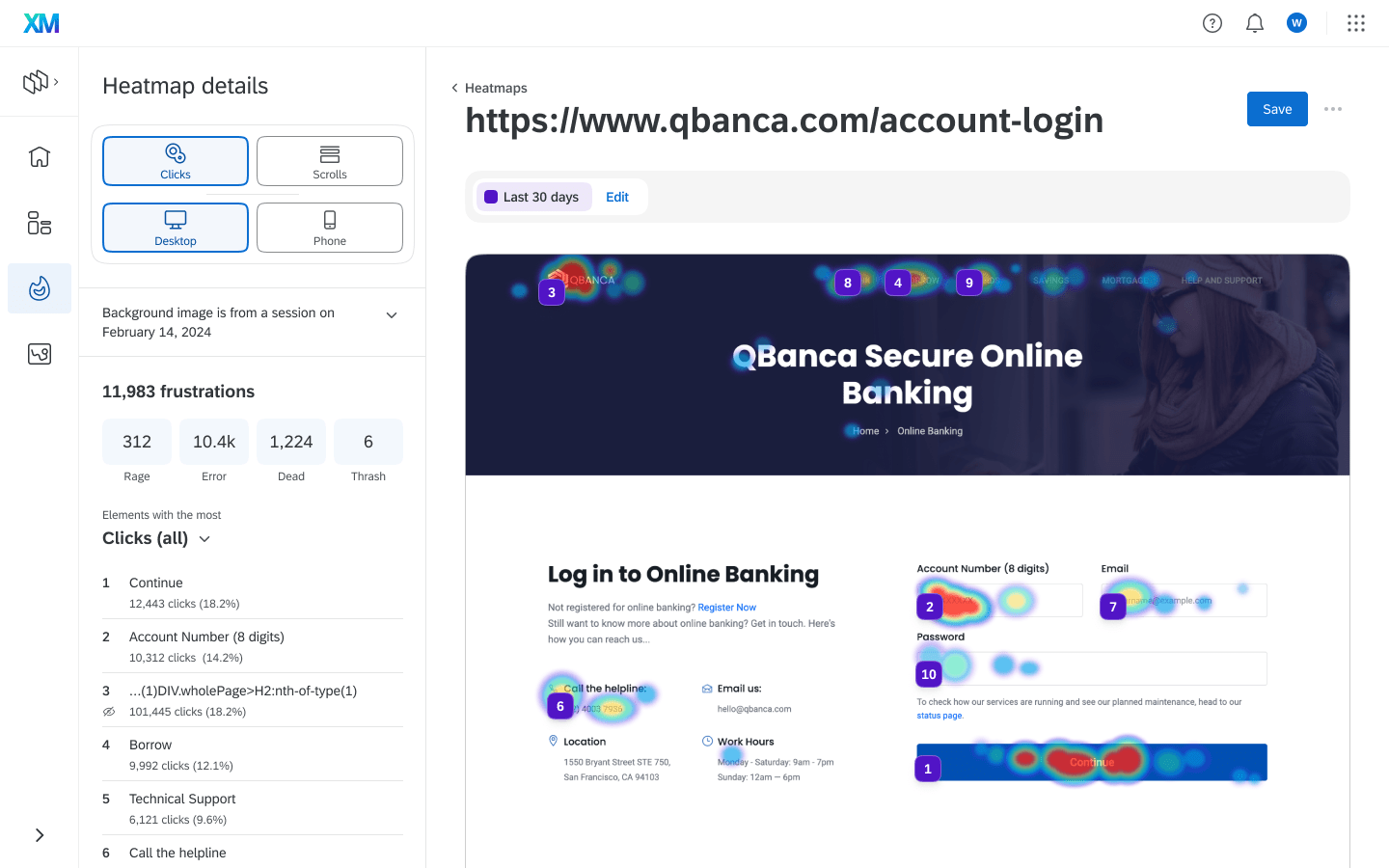
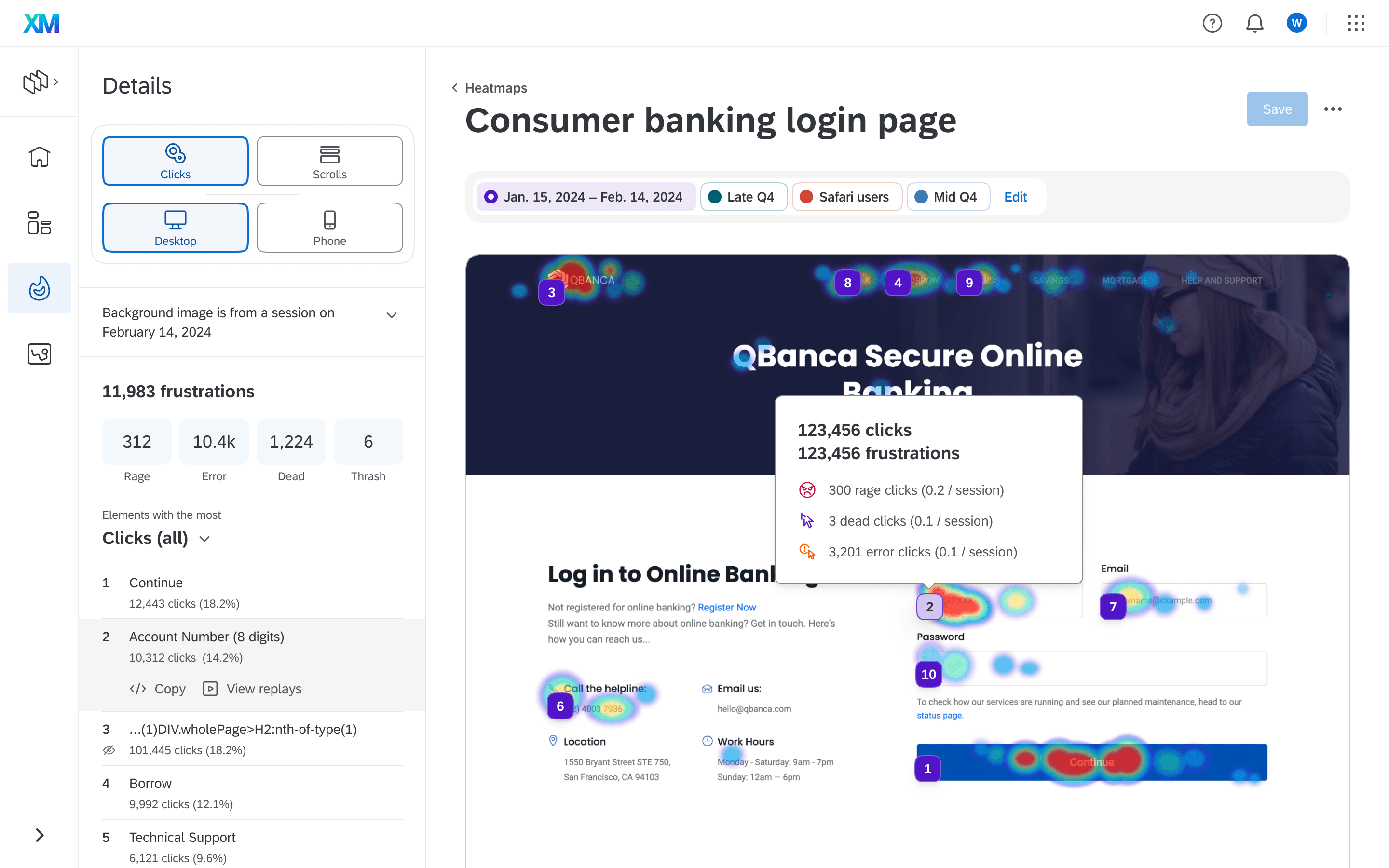
Click map visualization
This is the default and primary overlay. I considered approaches with varying levels of information density. The objectives of the tool shifted through development. Early concepts incorporated more metrics/reporting in the tool to minimize dependencies on the Platform. Those dependencies became less necessary by moving to an App model.
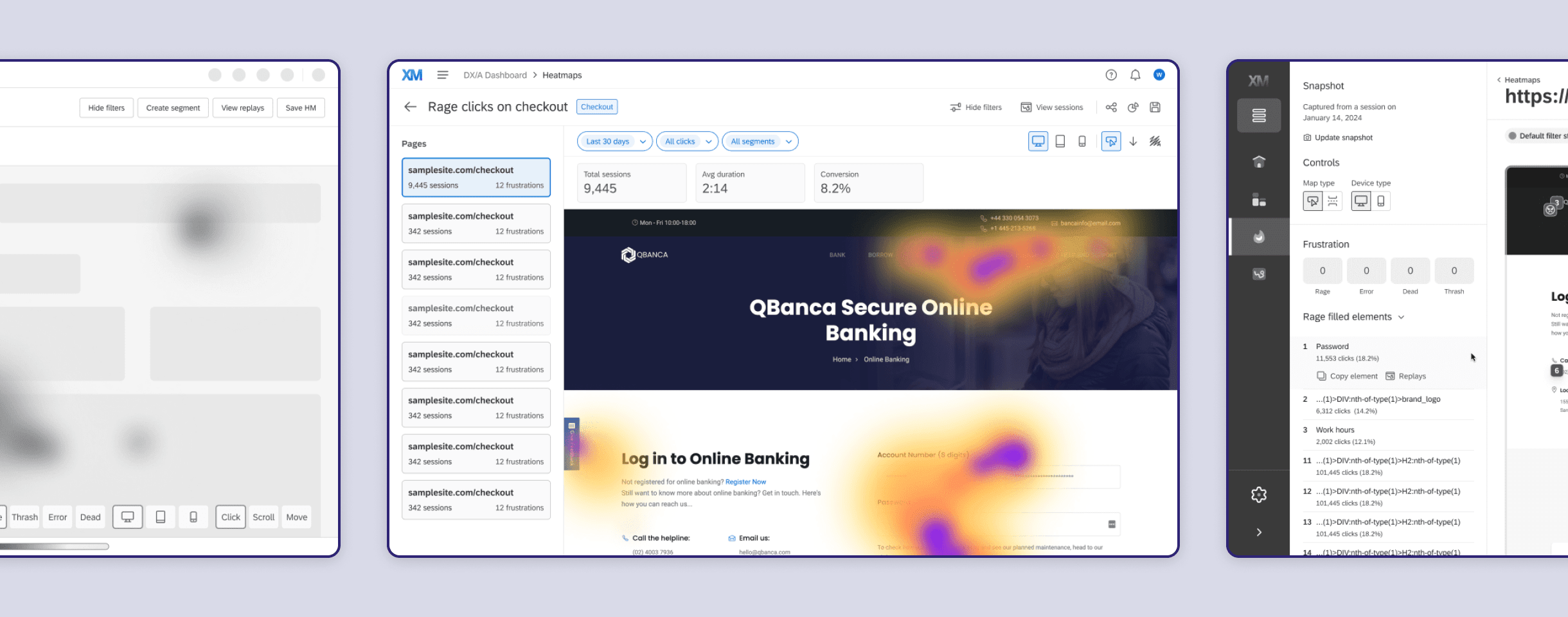
v1 simplified early considerations by focusing on light reporting of frustrations, sorting elements by engagement, and reinforcing the priority with badges
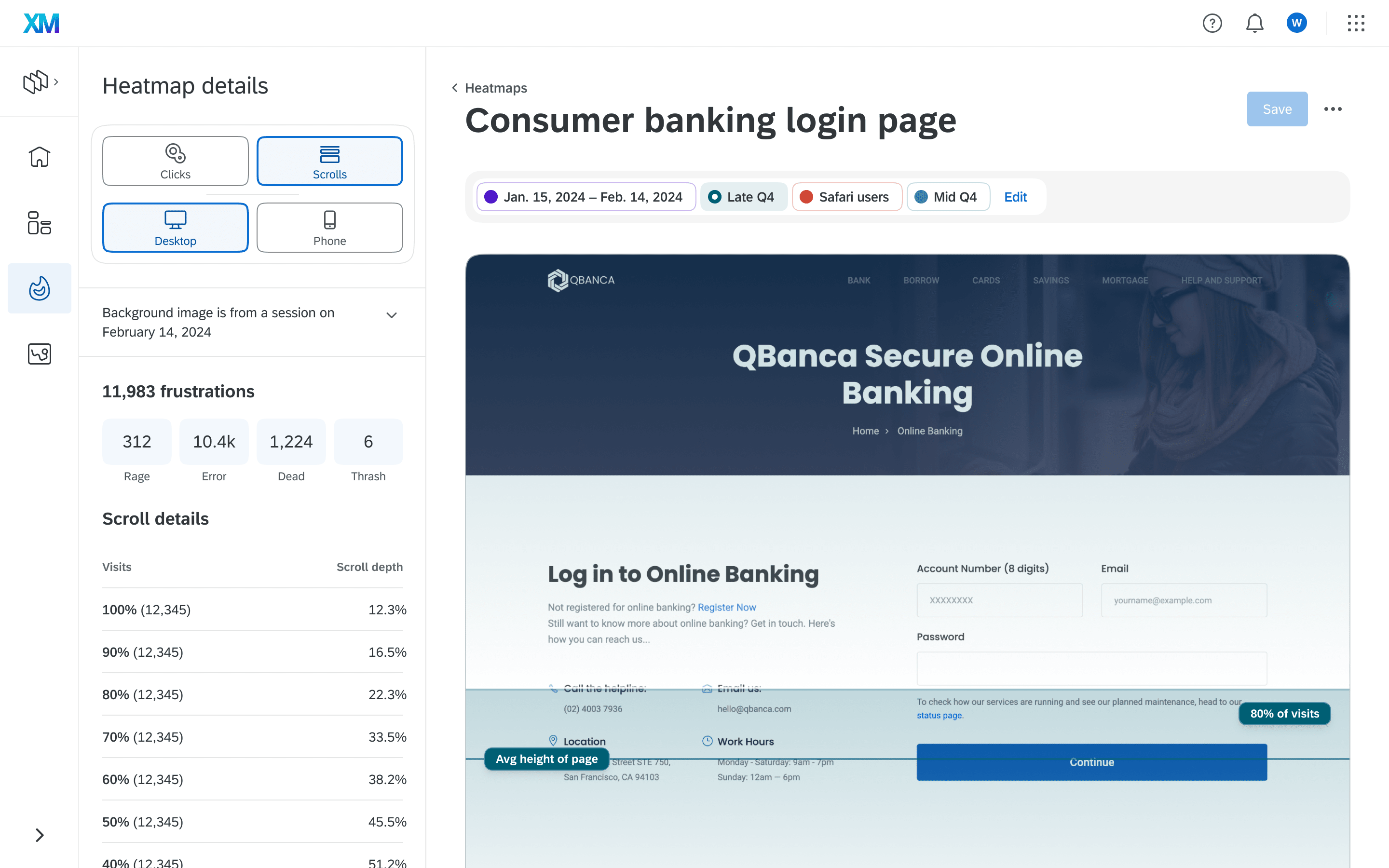
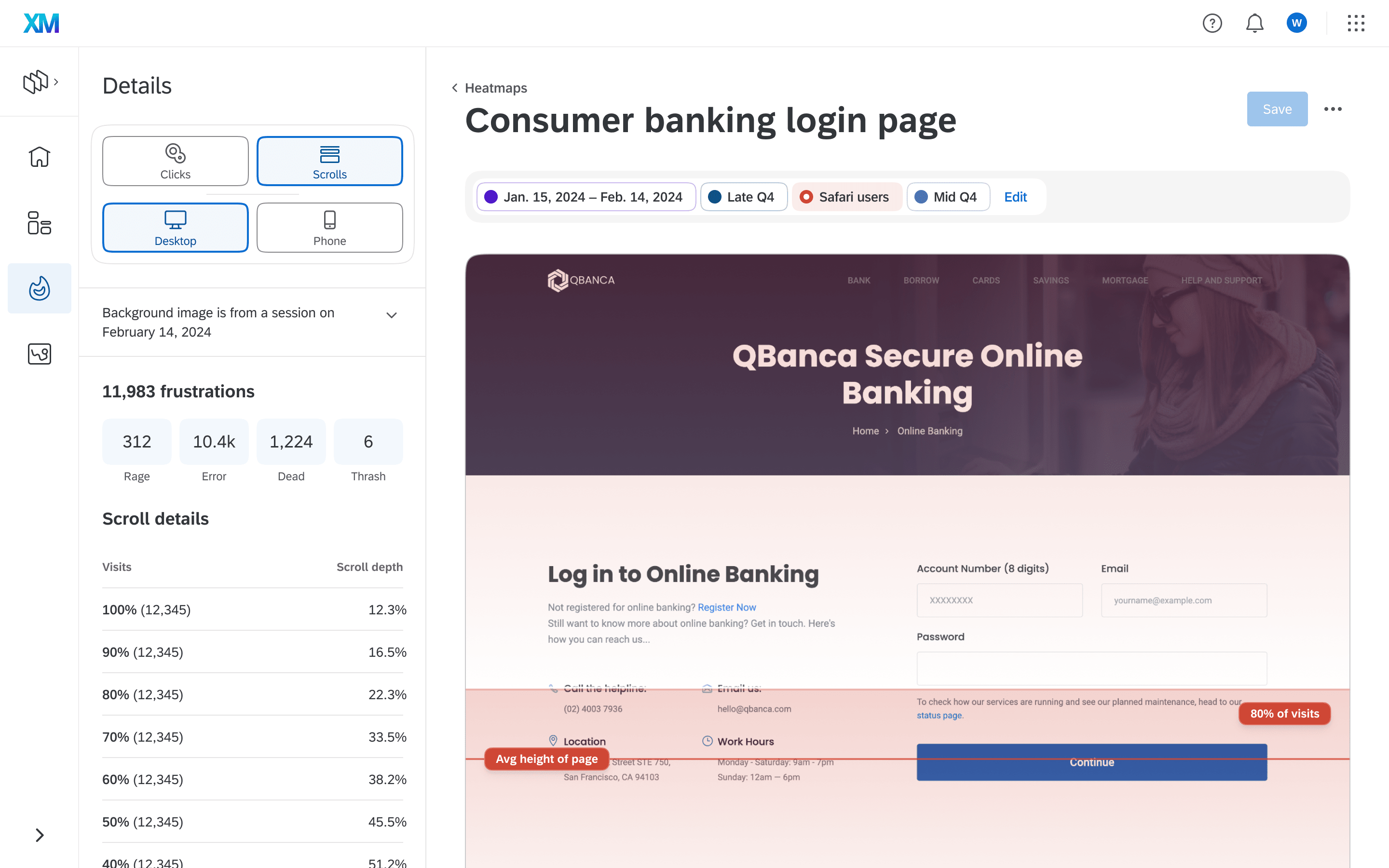
Scroll map visualization
This map type is complimentary to the click maps but less related to specific frustration metrics. Even though its use is adjacent to the needs of CX roles, it is useful when paired with funnel analysis opens the door to more potential customers.
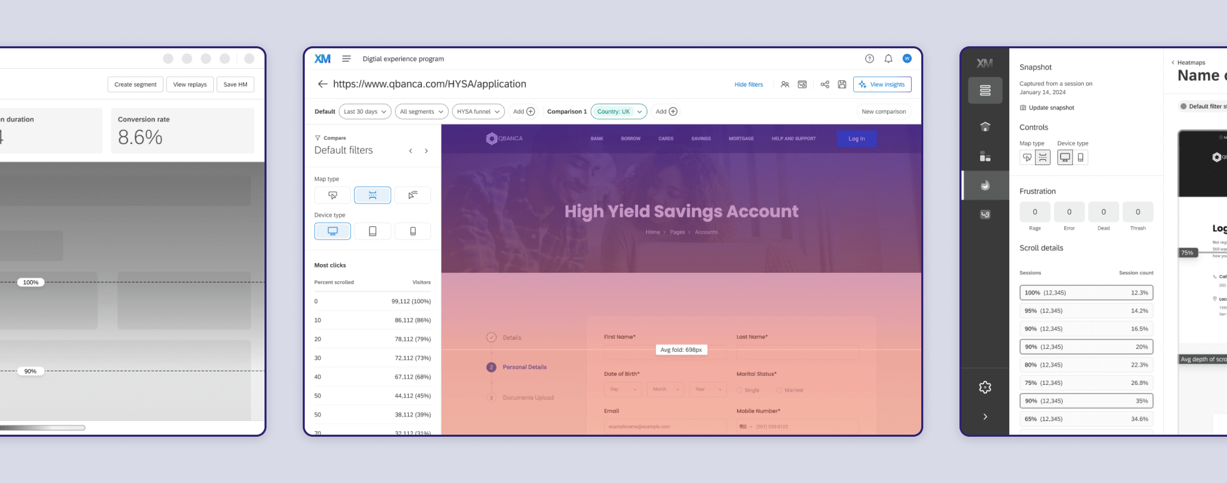
Research and refinements drove a lower interaction solution with fewer but clearer landmarks. Data is then broken down more granularly in the panel