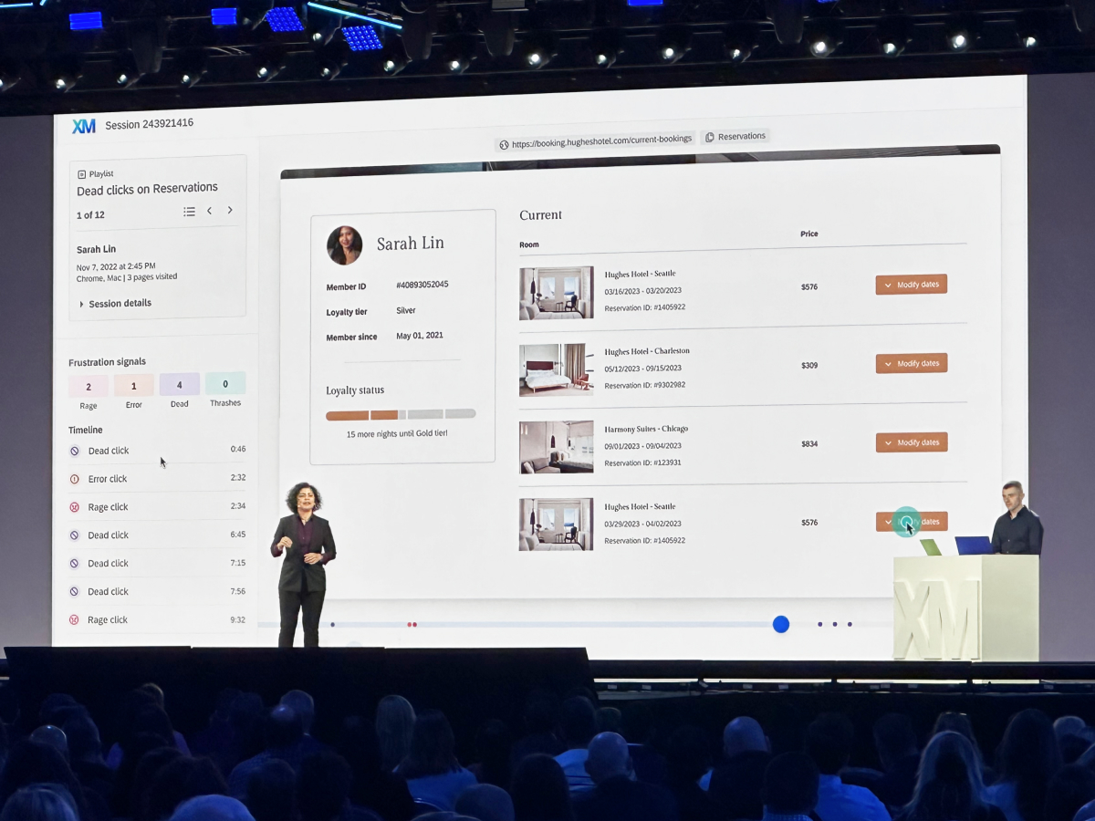
Qualtrics Session Replay
A new analytics capability that identifies and visualizes frustrating moments in digital experiences so CX and product teams can understand and remedy what led to them.
I designed replays to work as a part of Qualtrics’s existing Digital features then leveraged its immediate success to expand the team and create a Digital Experience Analytics platform.
Contributions
UX & UI Design, Information Architecture, Research, Team Building, Prototyping, Product Vision, Accessibility
Format
Responsive web, Product Feature
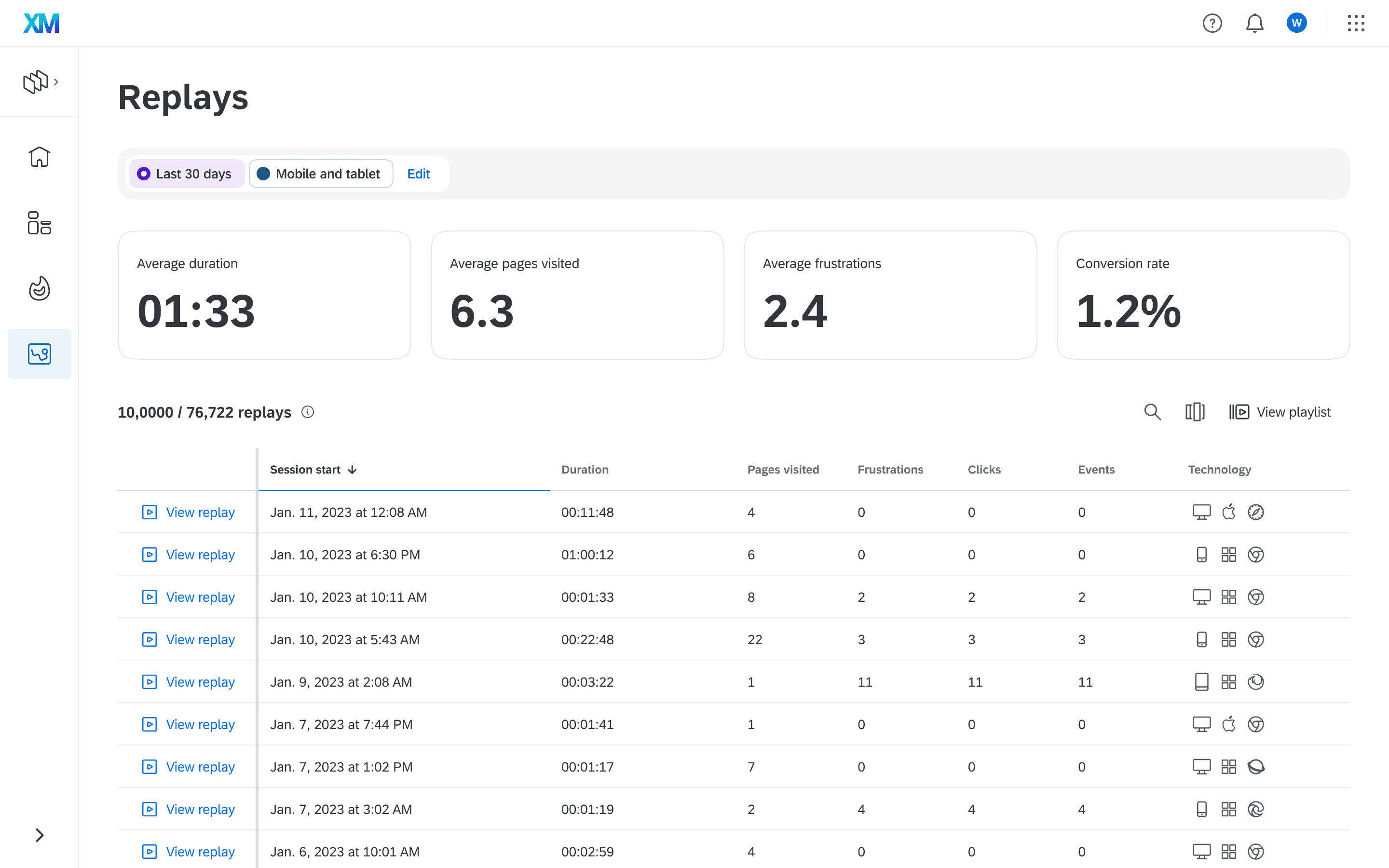
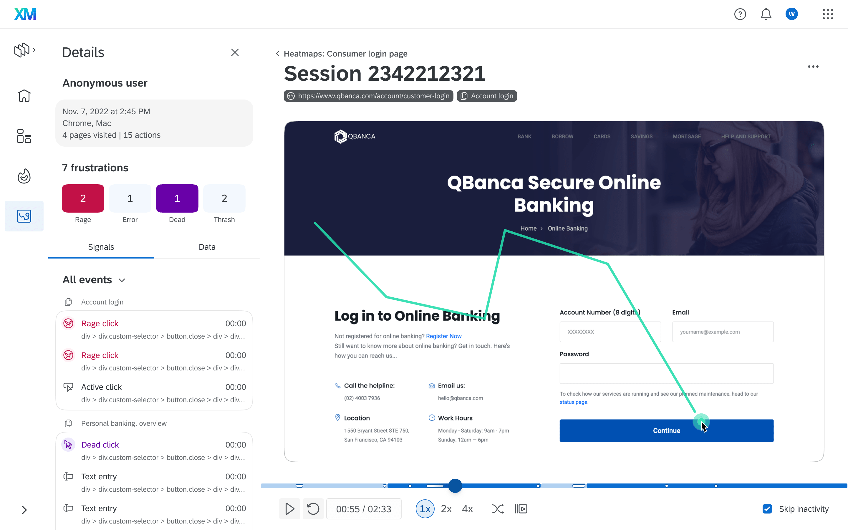
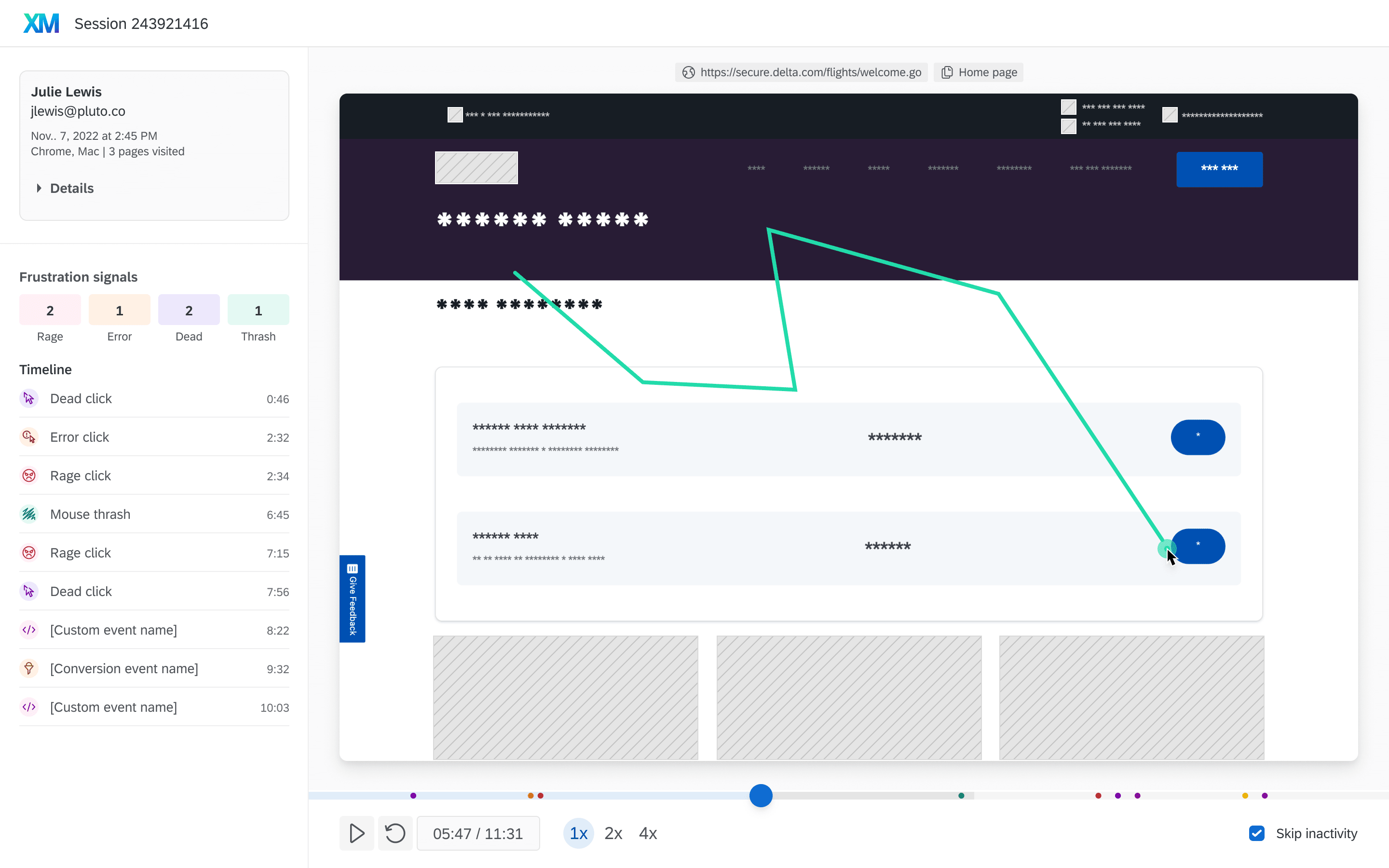
Session replay player, v1
As a new analysis tool in Qualtrics, the player was the centerpiece to design. It was shaped by three factors: Platform navigation and ingress dependencies, existing capabilities and technical workflows, and the data needs of CX users.
Similar tools exist in the market. CX users focussed on poor experiences and working with partners to fix or improve them. I worked to simplify and focus on frustration heuristics without overwhelming with traditional web analytics.
Ingress and navigation
Getting to the replay was a challenge and required working with platform teams. Multiple areas could link to a replay, but Qualtrics' nav and performance were not intended for lateral navigation. I considered modals, forward navigation, and full-screen simulated modals.
This led to a compromised initial solution where replays opened in a new tab while working with teams to be more precise in what replays they link to.
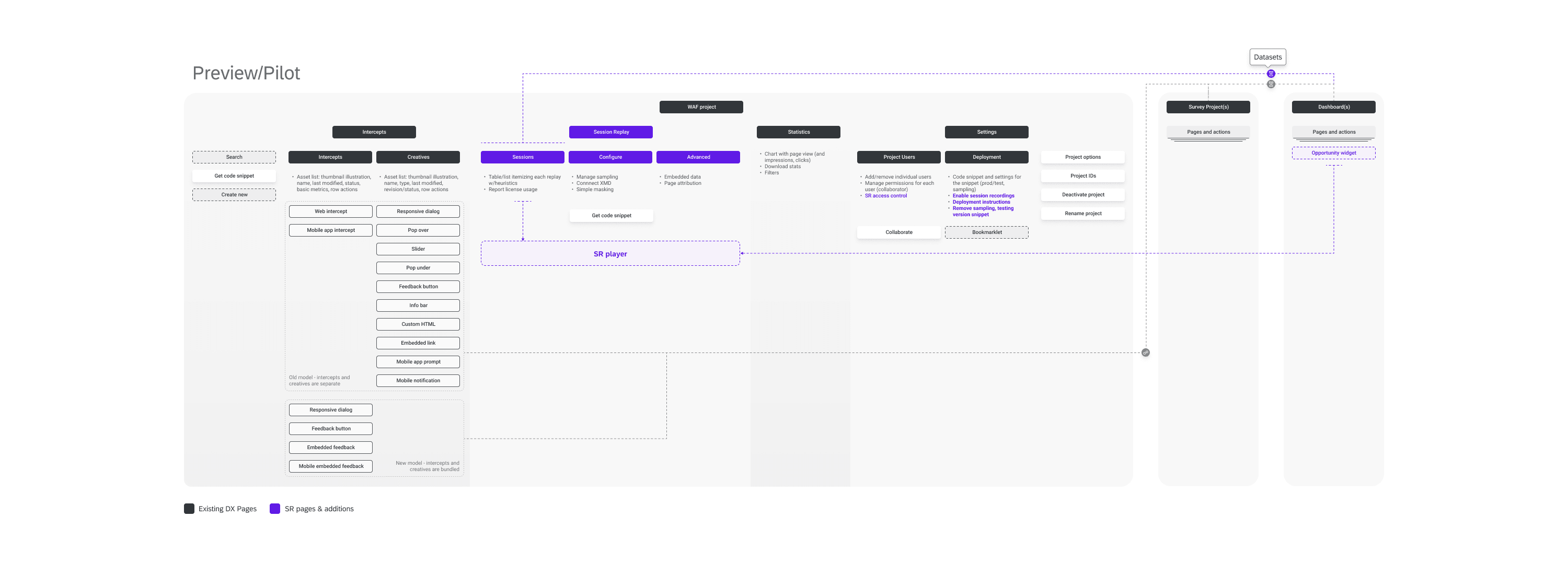
Modular, configurable
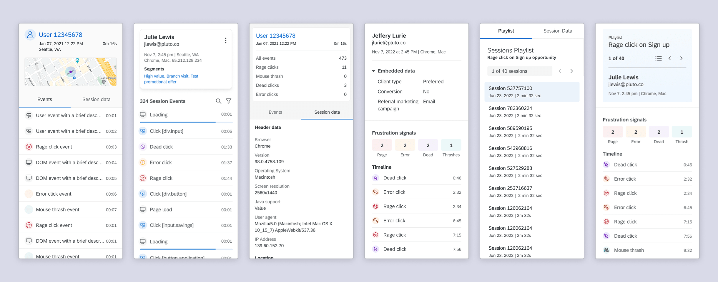
Requires developed along the way which led to a high level of configurability. Users could create custom events, pass embedded data for each session, connect profile-specific information, create custom page taxonomies, and selectively mask elements in the replays themselves.
Design refinements drove an increase in customer control over capturing or presenting sensitive information
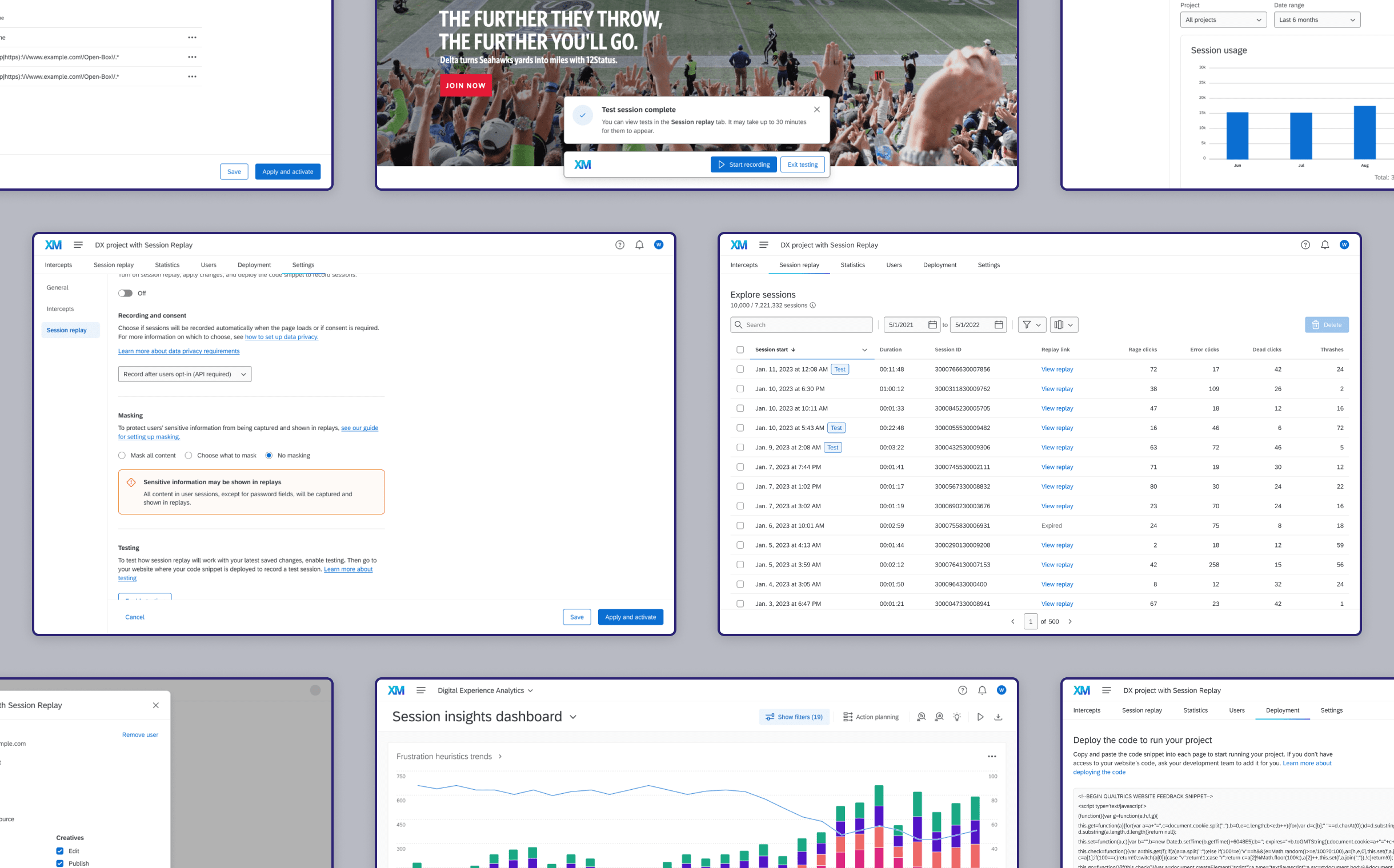
Settings, configuration, and platform integration
Early phases of the design were a technical exercise in evaluating if session replay could be added to Digital with minimal disturbances. Working around existing tech proved difficult and drove refactoring tech debt and re-architecting the tool to work across capabilities.
New functionality, refactored design, flex-in work
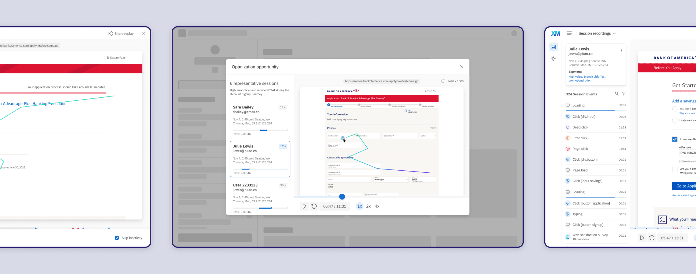
A lot had to come together to make it all work. I designed tooling for dataset management, a workflow for testing and publishing configuration changes, reworking IA to make deployment simpler, a new activation workflow, updated access control, custom dashboard widgets, and worked with other designers for other improvements.
Announcement, early lessons
Session Replay was announced at Qualtric's annual conference, X4. There was a lot of enthusiasm and the Digital sessions were all crowded. Customer buy-in was strong and fueled active feedback through launch. Customers began asking for improvements to known compromises and more digital tools that easily worked together.
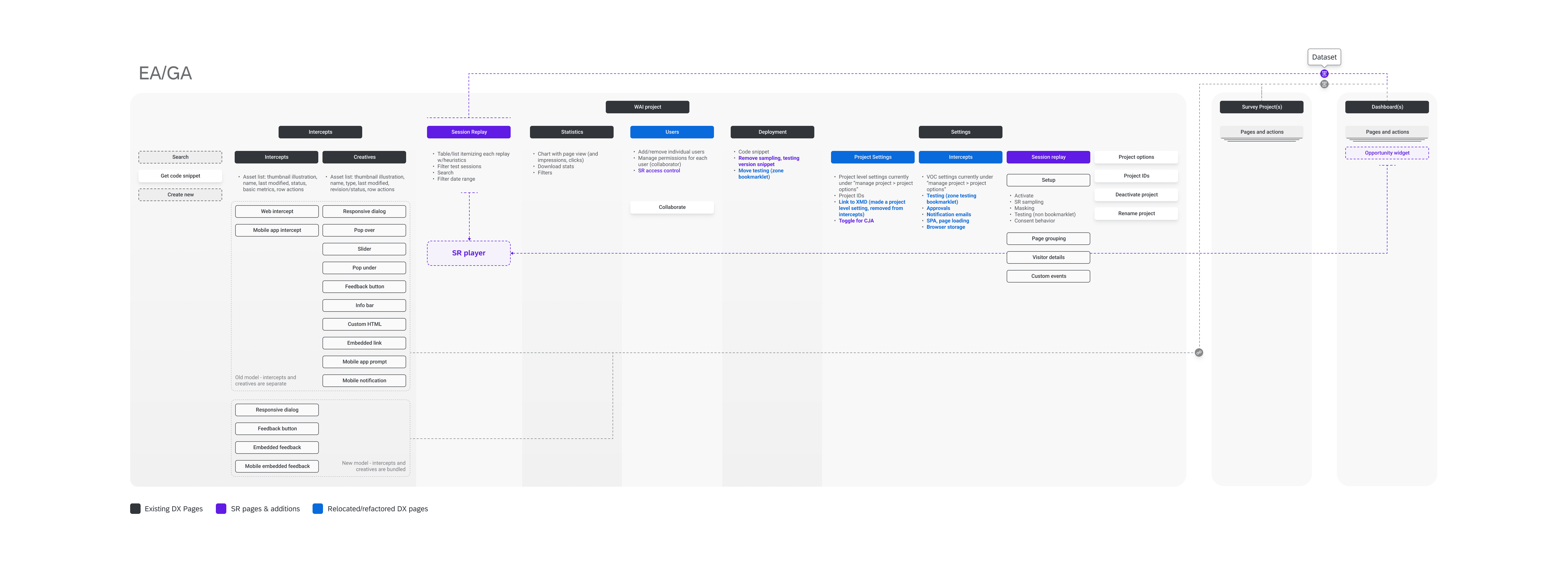
v2 Replays, Digital Platform
A successful launch, early lessons and feedback, and a parallel effort to define a longer-term vision directly shaped the next version of replays and the creation of a Digital Platform.
The next iteration improved on navigational compromises, better-supported replay playlists, added more events and metrics, and benefited from additional Digital tools built to leverage replay data.